Modern smartphones are powerful computers that can do a lot at once, but a small screen ensures that a poorly designed user interface will severely restrict how well someone can multitask. Unfortunately, the stock Android multitasking UI, known as Overview, leaves a lot to be desired, meaning phones that opt for this interface simply don’t multitask as well as others.
Android Central Labs
Android Central Labs is a weekly column devoted to deep dives, experiments, and a focused look into the tech you use. It covers phones, tablets, and everything in between.
Much of this frustration started for me when the Android team redesigned the multitasking UI during the Android 9 Pie update. Instead of the vertically-scrolling card interface that showed four or five apps at a time, Google’s design team opted to follow the old Palm Pre model of large, horizontally scrolling cards — something that isn’t very surprising given the head designer of Android was also on the Palm WebOS team.
This new design made multitasking very inefficient because only one large app card is visible on the screen at a time, while a sliver of one additional app is shown off to the side. There’s no way to tell what app is next in the list until it appears, making it hard to switch quickly between more than two apps at a time. Thankfully, companies like OnePlus, Vivo, Samsung, and a few others have figured out that this UI isn’t the best.
From grids of apps to floating windows, triple-app split screens, and quick app switching, I’ve picked out my favorite Android multitasking UIs that’ll let you get more done in less time. The most efficient way to multitask on a modern Android phone is to use swipe gestures, not the traditional 3-button navigation layout, so many of the gesture-based features I speak about below are dependent on that setting.
The best: OnePlus
OnePlus and Oppo phones let you quickly switch between 10 apps at once with a single swipe and a tap.
OnePlus has the best default multitasking UI you’ll find on any Android phone, but it wasn’t always that way. Back when Android 9 Pie came out, OnePlus quickly adopted Google’s terrible UI but realized its mistake when its most loyal users were unhappy with the oversimplified UI. Since then, OnePlus’ multitasking UI design has managed to bridge the best of every idea, offering a quick way to instantly swap between seven apps at once, run two apps at once, and even quickly hover a third app on the screen.
From the overview UI, it’s possible to choose from the last 10 apps with a single swipe and a tap. This is thanks to the quick slider at the bottom that shows the icons of each app along with a large card of the app above it. This is the fastest you can switch between apps on any Android UI and it’s also available on OPPO phones thanks to the company’s merging of Color OS and Oxygen OS code bases.
Ironically, this UI is very similar to what Apple used to have in iOS 7-9 before the iPhone X came out. I say ironically because the company made multitasking worse by removing the bottom row of icons, but thankfully, OnePlus and OPPO realized their mistake and capitalized on it.
You can also quickly split the screen or make the current app float by dragging your thumb up from the bottom of the screen until the current app card rests in the “floating” or “split” sections that appear on the screen. Some other phones, like Samsung, have a version of this feature but don’t allow you to do it in a single swipe.
The introduction of the Canvas feature from the OnePlus Open was rolled into the Oxygen OS 15/Color OS 15 update for any eligible phone and allows you to run split-screen apps in a “nearly full-screen” mode. This makes it more convenient to use split-screen mode because you can have the prominent app take up 90% of the display while the other rests at the bottom 10%, waiting to be maximized.
Runner-up: Vivo
Vivo offers a selection of a grid or AOSP-style card list right on the Overview screen.
Out of the box, Vivo users can quickly select between the traditional single-large-card UI and a tablet-like grid of cards with the tap of a button. On the Overview UI, just tap the icon at the bottom to switch between the two views, making it easy to select from 4 apps via a single tap and another four with a swipe.
You can find this grid of cards on other phones, but most require you to do something special to enable it. Foldable phones usually only have this UI on the large inner display, and while Samsung phones offer several similar UI options, you have to separately download the Good Lock app from the Galaxy Apps store along with a separate module just to find the option. Vivo makes it available via a single tap on all its phones.
Vivo’s UI also features the same swipe-up-and-hold to either split or float the active window that’s on OnePlus and OPPO phones. In fact, most phones from China sport this feature, making us wonder why Samsung, Google, Motorola, and others don’t implement it.
Power user option: Samsung
Samsung’s default stacked cards in One UI 7 offers kinetic scrolling, improving the stock experience, but the real key lies in using one of the many Good Lock alternatives.
Samsung finally got with the program and did something about the terrible stock multitasking UI in Android when it began rolling out the One UI 7 beta at the end of 2024. The new UI looks like a mash-up of Android and iOS designs, sporting the stacked card look of iOS with the four quick icons at the bottom.
The problem with Samsung’s design is that the icons at the bottom aren’t based on active apps. They’re based on an algorithm Google built into Android that tries to figure out which apps you use most often. That means these icons are almost never the same, and while they can sometimes be helpful, the lack of consistency is more a problem than a help.
At the least, Samsung’s cards “snap” into place, making it easier to focus on each one as it passes by. But you don’t have to deal with this nonsense UI if you really want to multitask. Just download Good Lock and change basically anything you see on the Overview screen.
With Good Lock, you can select from five different “task changer” UI designs. List is the default option that shows one vertical card at a time. Grid is the one I praised Vivo for including by default, and it shows six app cards on screen at a time. Stack is the new default in One UI 7 and shows one prominent card up front with three cards “peaking” behind it. This one makes it easier to see what app is next in the list but doesn’t enhance multitasking as much as the Grid option does.
The Vertical List option resembles the original Galaxy Nexus multitasking UI of vertically-scrolling cards, which makes better use of screen space than the default horizontal list. The last option, Slim List, is the “real” power user option as it offers seven apps to choose from immediately.
Samsung also offers hover and split-screen app options, but you need to open up the Overview UI first, then long-press on a card and drag it to the appropriate action. This is an extra step versus what Vivo, OnePlus, OPPO, and other Chinese brands offer.
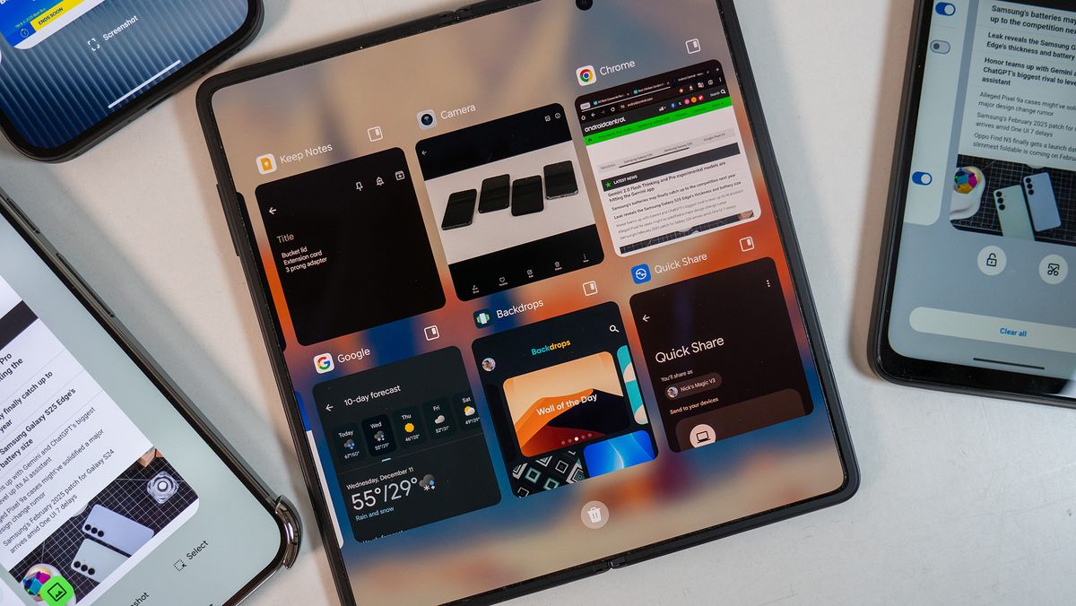
Honorable mention: Foldables
Book style foldables offer multiple ways to multitask, and most have a pinnable dock that allows for one-tap multitasking.
Technically, book-style foldables like the Google Pixel 9 Pro Fold and the OnePlus Open offer the best multitasking experience on any phone, but not everyone likes the size of these devices. Most offer a different multitasking experience on the smaller outer display than what’s on the big inner display.
Some foldables, like the Honor Magic V3 below, don’t have an option to “pin” the dock at the bottom of the screen. Most other book-style foldables, however, allow you to have this dock present at all times, meaning multitasking is a single tap away at all times.
OnePlus wins the award for best foldable multitasking UI because its small screen UI is identical to its other phones, including that handy row of app icons at the bottom. When you open the phone, you’ll find there’s no real reason to ever open Overview, thanks to the app dock at the bottom of the screen.
While most foldables have this dock now thanks to Samsung and Android 12L, OnePlus one-ups things with its Canvas software that lets you run three apps at a time on the big screen. You can arrange these in several ways, but it takes multitasking to a new level.
Barely better than stock: Google, Motorola, Nothing, Honor
Many Android manufacturers have chosen to stick mostly to the stock UI but add a few convenience features. Motorola and Google offer quick action buttons at the bottom for taking a screenshot, allowing you to screenshot an app in the Overview UI without having to reopen it. I’m not sure who uses this, but I’ve never found myself tapping the button other than to see what it does.
Motorola also offers a button below the cards that locks the app in memory, making it a priority to stay in RAM for quick access in case the phone is running low. This is best for phones like the Moto G 2025 that only have 4GB of RAM and might reload apps often. A third button is available from the Overview UI on some Motorola phones when the sidebar gesture option is enabled, allowing apps to be quickly floated with a tap and then moved into a semi-hidden side panel when minimized.
Google Pixel phones have a screenshot button and a second “Select” button that can extract text from an app tile, but it’s far slower and clunkier than just swiping between two apps using the gesture bar at the bottom of the screen. Some cards on the Pixel Overview UI also have a quick “copy link” or “copy image” button, which is actually quite handy on some occasions. Overall, though, the Pixel’s Overview UI is overengineered and poorly designed.
These companies add something to the barebones AOSP experience but don’t fix the core problem of the large card design.
Honor keeps the default giant card UI but enhances things by adding a small button to the top right of each card to instantly float the window. This doesn’t help with switching between more than two apps quickly, but it’s at least a little better for juggling three apps when you have one floating. Honor also has a quick hover and split-screen action when you swipe up from the bottom of the screen and drag the card to the appropriate action.
Nothing doesn’t add any buttons to the Overview UI but does allow users to quickly float the active app by sliding up from the bottom of the screen until the card gets to the top half of the screen. This will put the app in a floating window for nicer multitasking, complete with clearly marked “minimize” and “close” buttons in the app’s floating frame (similar to Motorola), but overall, it’s the most basic of all four companies listed here.
While these four companies do something better than AOSP, they’re niche features that you probably won’t use all the time. They don’t fix the main problem, which is the inefficient single giant card on the screen and no real way to quickly switch to another app without needless scrolling. Additionally, none of them offer the kinetic scrolling Samsung offers, making it more difficult to find the app you want as the card goes whizzing by.
AOSP needs a facelift
I find it very hard to understand why Google hasn’t fixed this UI in the seven years since Android 9 Pie was released. I got excited when the first Pixel Fold was unveiled in May 2023 and showcased a grid-like multitasking UI, only to later find out that this UI only appeared on the large inner display, not the outer display that I used most of the time.
The bottom line is that Android’s default Overview multitasking UI needs a huge facelift. The best alternative right now is OnePlus’s default design, which takes the large card format and substantially enhances it with a simple icon grid below, making it easy to switch between the last 10 apps with a single swipe and a tap.
Every other company convolutes this process in some way, with the next-best option falling under the grid format on Vivo and Samsung phones or the vertically-scrolling “slim list” on Samsung’s Good Lock app. Any company that opts for stock Android is simply stuck with the worst option possible, making multitasking a chore rather than a joy.
Google needs to address this with Android 16, and it needs to happen ASAP. You have lots of options to choose from, Google. Any of them would be an improvement over what’s currently available. Thanks.
Get the best in multitasking, the fastest processor on any phone, the fastest charging, the best battery life, and six years of software support with the OnePlus 13, our favorite Android phone ever.